
Redcliffe Garden Centre - Identity Case Study
My belief is that good design starts with research.
I was commissioned to create a new, independent identity for Redcliffe Garden Centre who was previously branded under the buying group Plants Plus. The process started with a consultation with the owners where I was able to learn more about their business, their passions and what they wanted to achieve with their new identity.
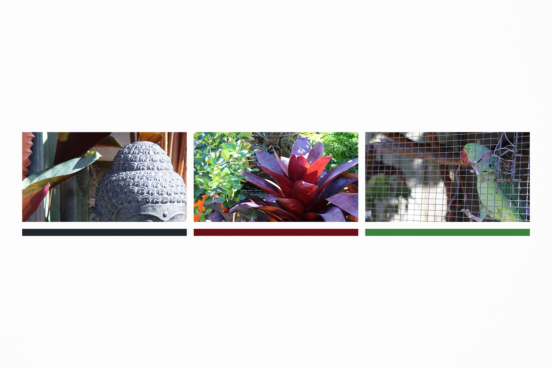
I began to explore the nursery and document what made Redcliffe Garden Centre distinctive. Inspired by the unique characteristics of the nursery; roaming chickens, pet parrots, Balinese statues and of course the plants, I started sketching the different shapes I had found.
The outcome was an organic icon, directly inspired by the spiral carvings of the statues and the inner shape of the bromeliad, that I believe truly represents their business.
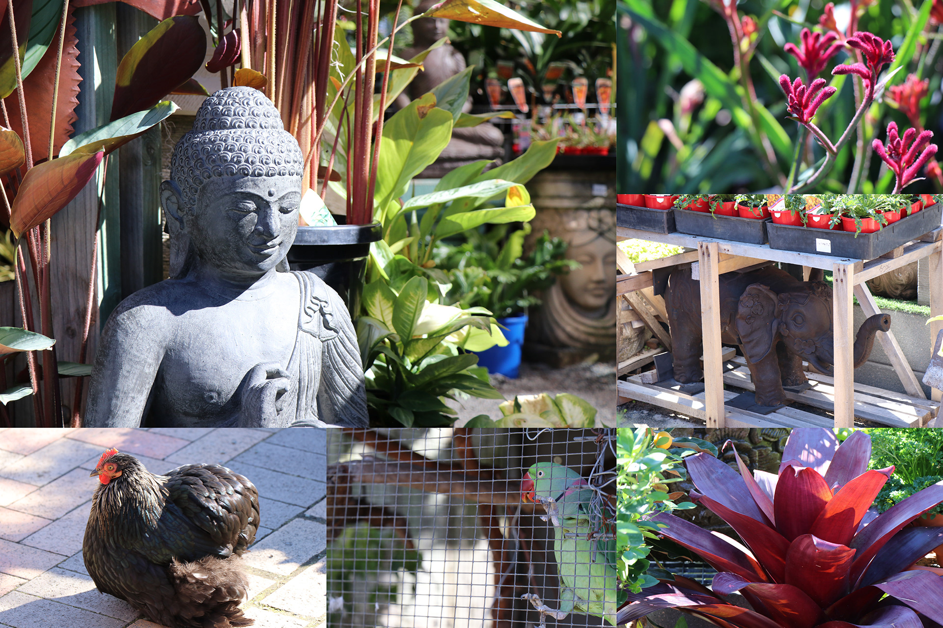
Inspiration taken from photographing the garden centre
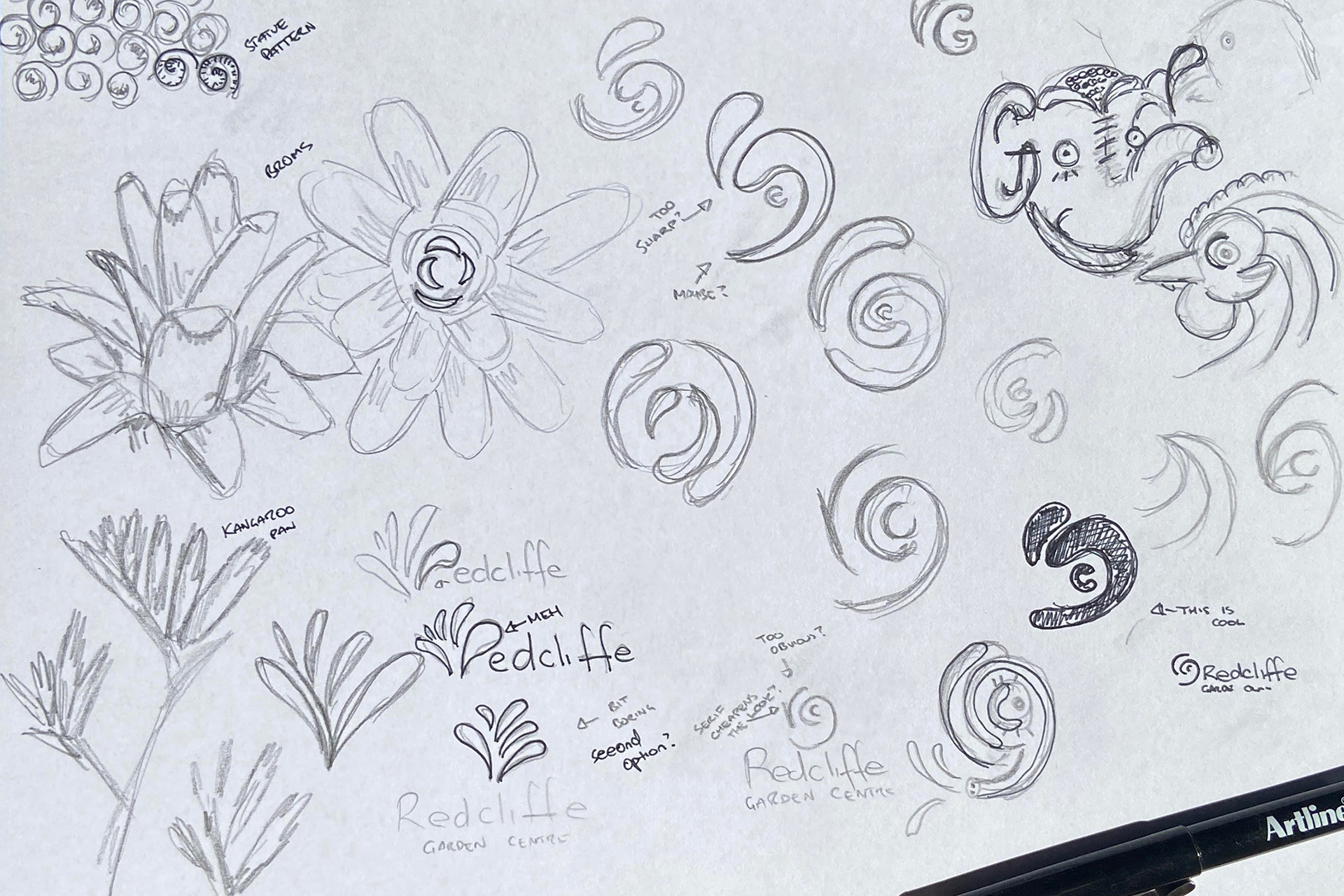
Sketching and brainstorming different ideas based off inspiration
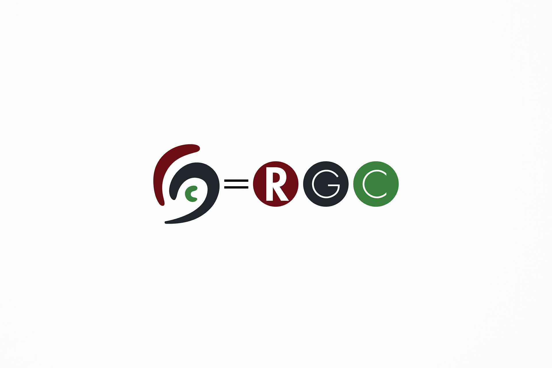
Breaking down the icon
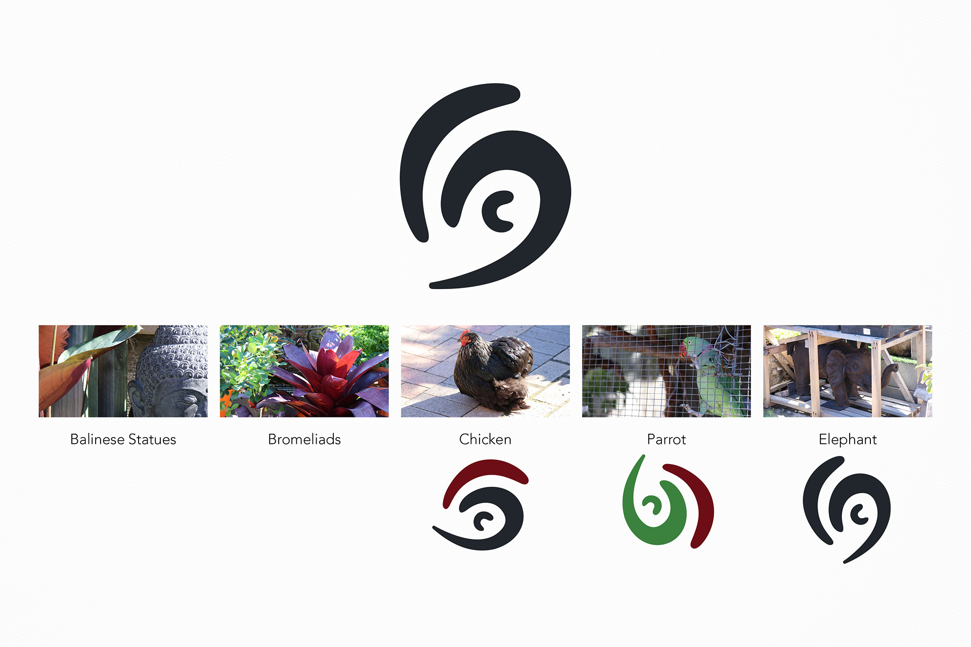
How the icon got its shape
Colour Inspiration
Final Logo
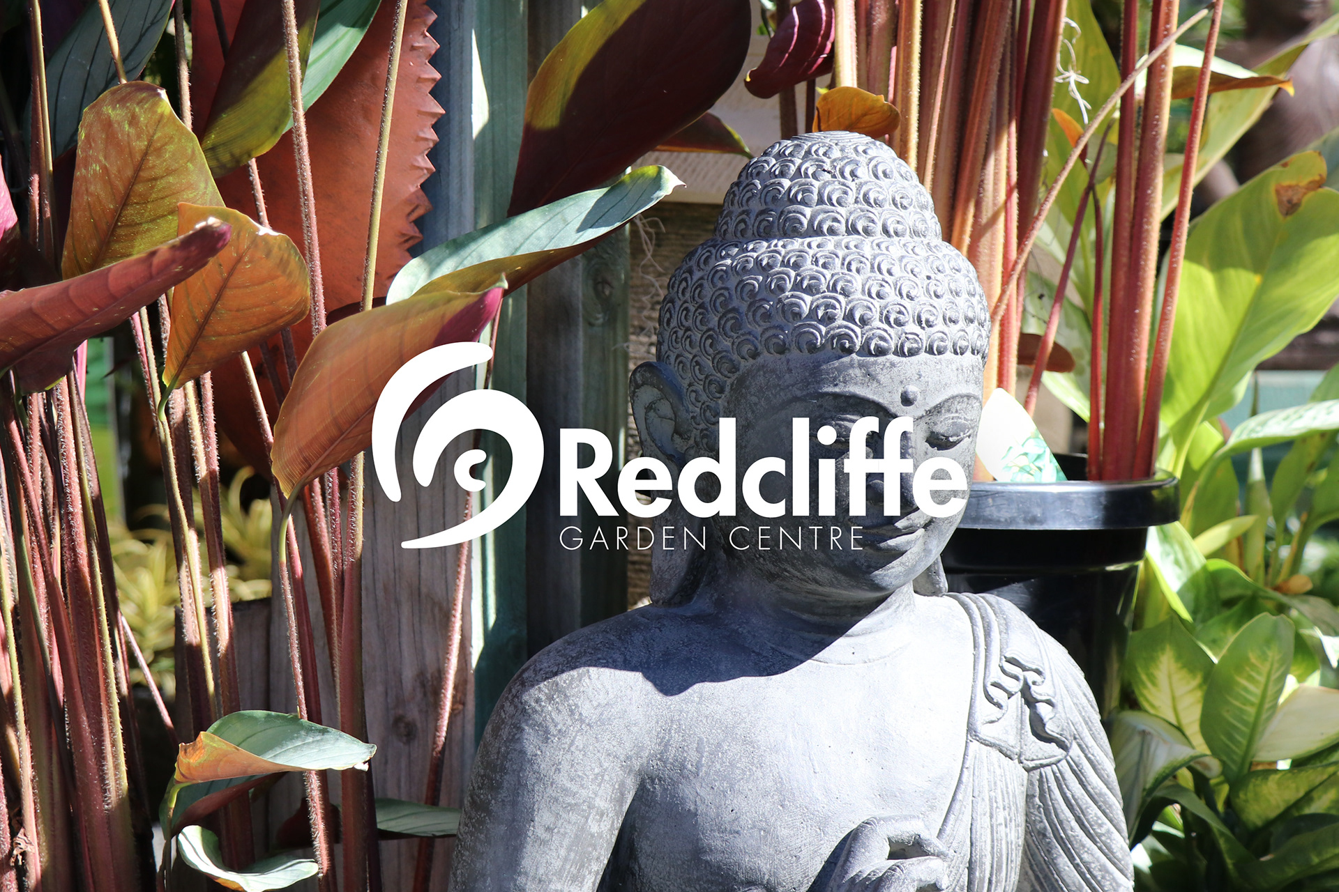
Final logo